Dried Piper
Dried Piper Logo Design and Branding

About the project
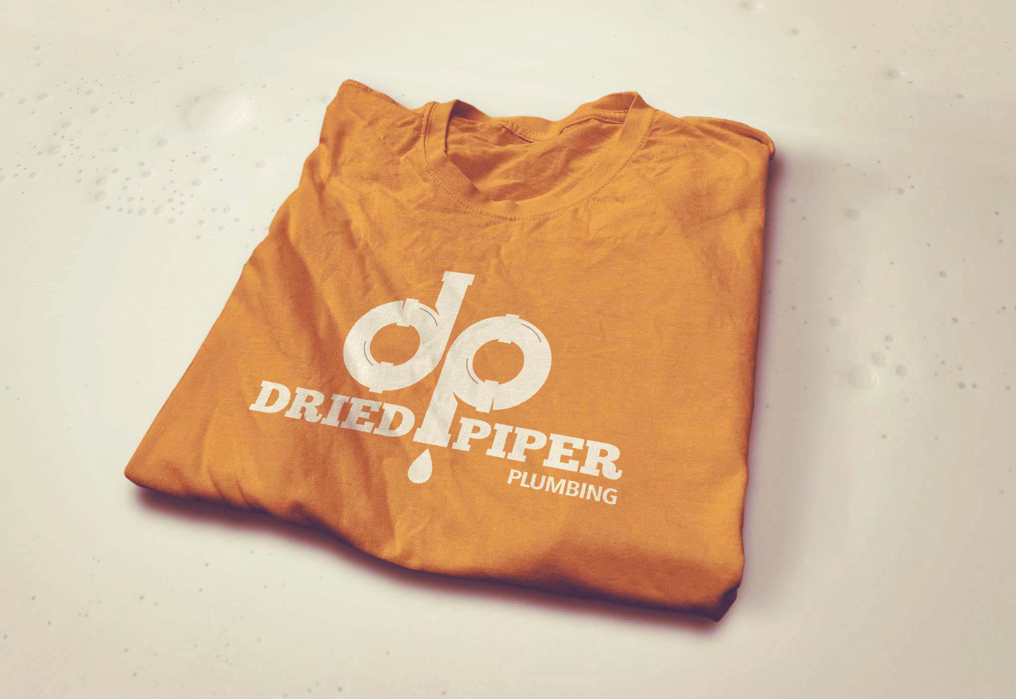
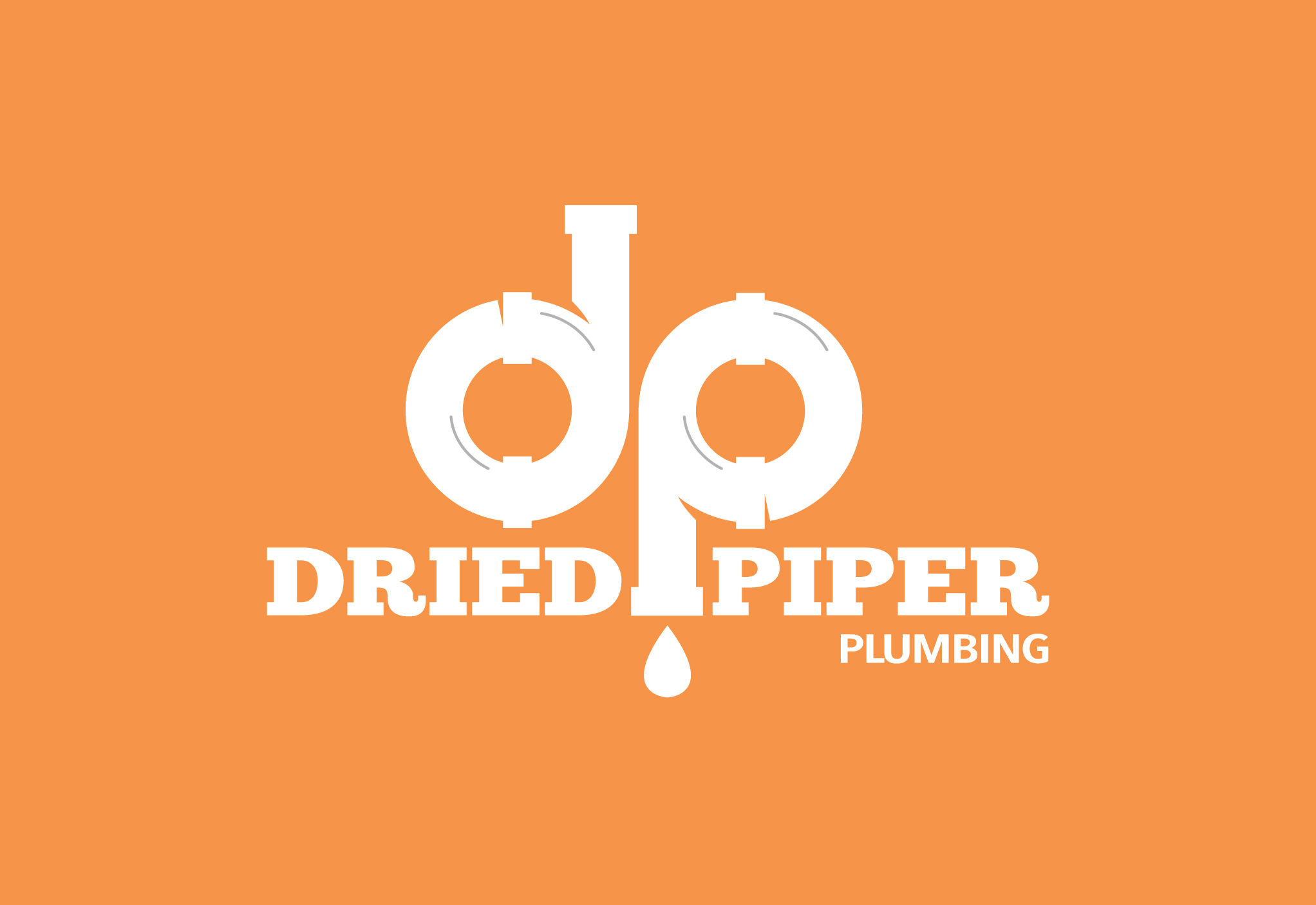
This project called for a logo design and brand standards. The logo is intended to represent a pipe that is a play on the first letters of the company name – D and P. The drop represents the water that is flowing through correctly because of the services provided by Dried Piper.
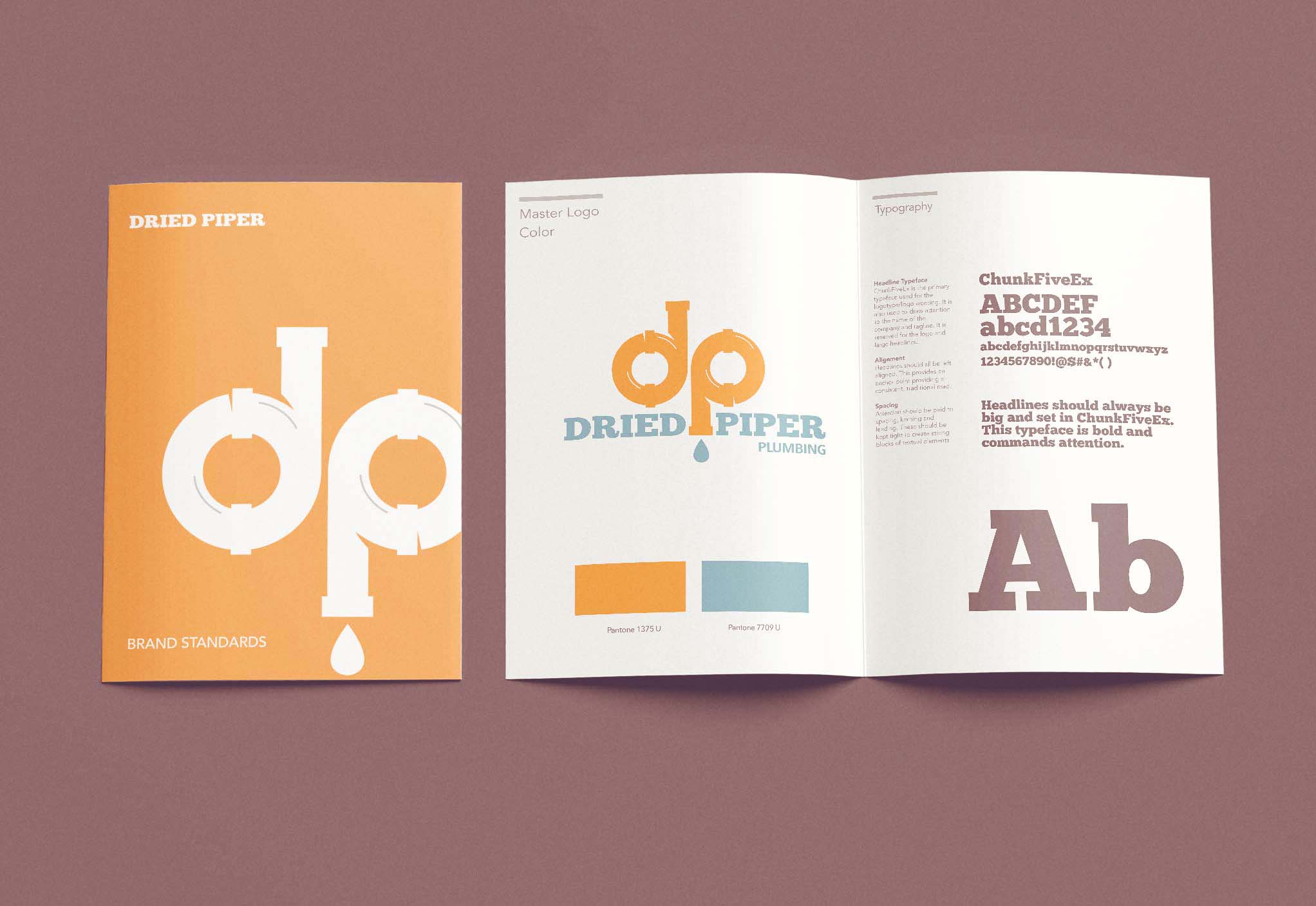
The orange in the overall color palette is designed to stand out and get attention while the cool teal color gives a sense of cleanliness and provides a nice complimentary color to the orange.
Deliverables:
- Original logo concepts
- Font selection
- Color palette selection
- Logo format for print and digital
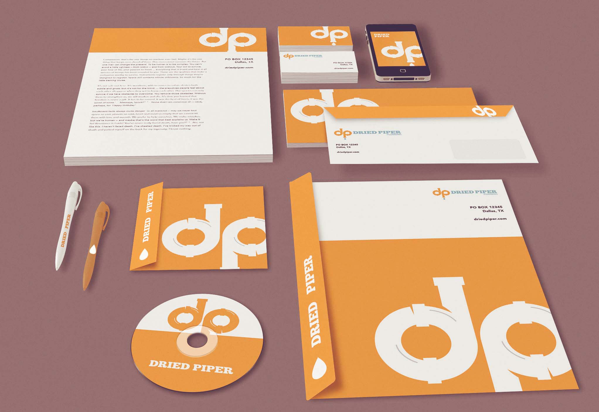
- Complete brand standards kit
Design tools:
- Illustrator
- Photoshop
Inspiration gallery
The following are examples from the logo presentation. While these are not all of the brand mockups presented to the client, these show how the logo could be used in collateral, products, packaging and branded materials.
