Ferrell Metalcasting Solutions
Ferrell Metalcasting Solutions Logo Design
About the project
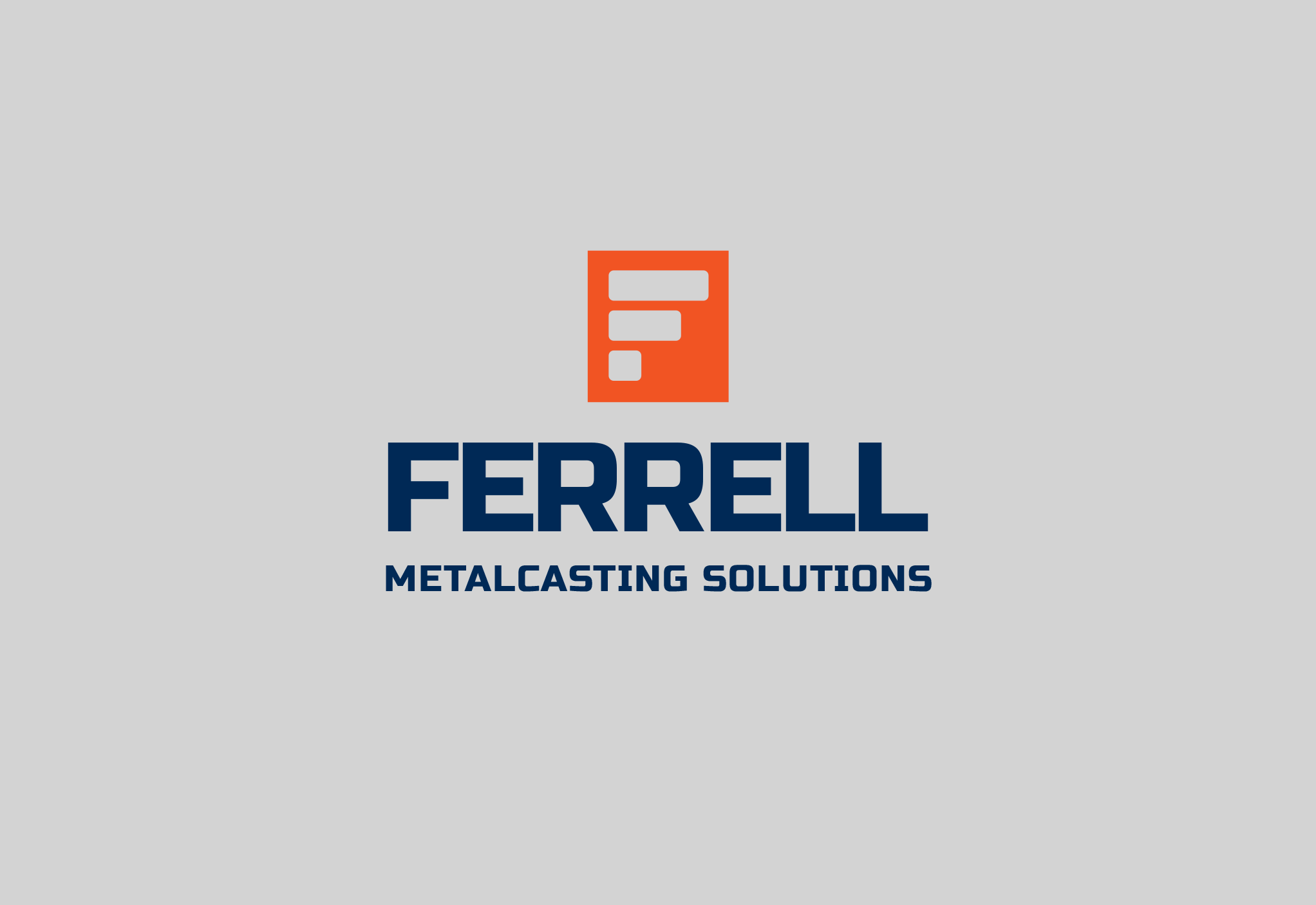
This logo was designed to be part of a global company rebranding. The client wanted something that would be fitting of their industry while maintaining a classic and familiar aesthetic. The company that was founded in 1980 grew to one of the premiere manufacturers representative firms for die casting and foundry equipment.
The company was going to undergo a name change and with that they needed a logo update as well.
The logo itself is very industrial in design with a color palette that is vibrant. The mark in the logo is a stylized F but is also intended to feel like a die casting mold which is very much the part of that this company does. The logo is intended to evoke a sense of strength, stability and durability.
The client was very pleased and has since implemented the logo into the company’s website.
Deliverables:
- Three original logo concepts
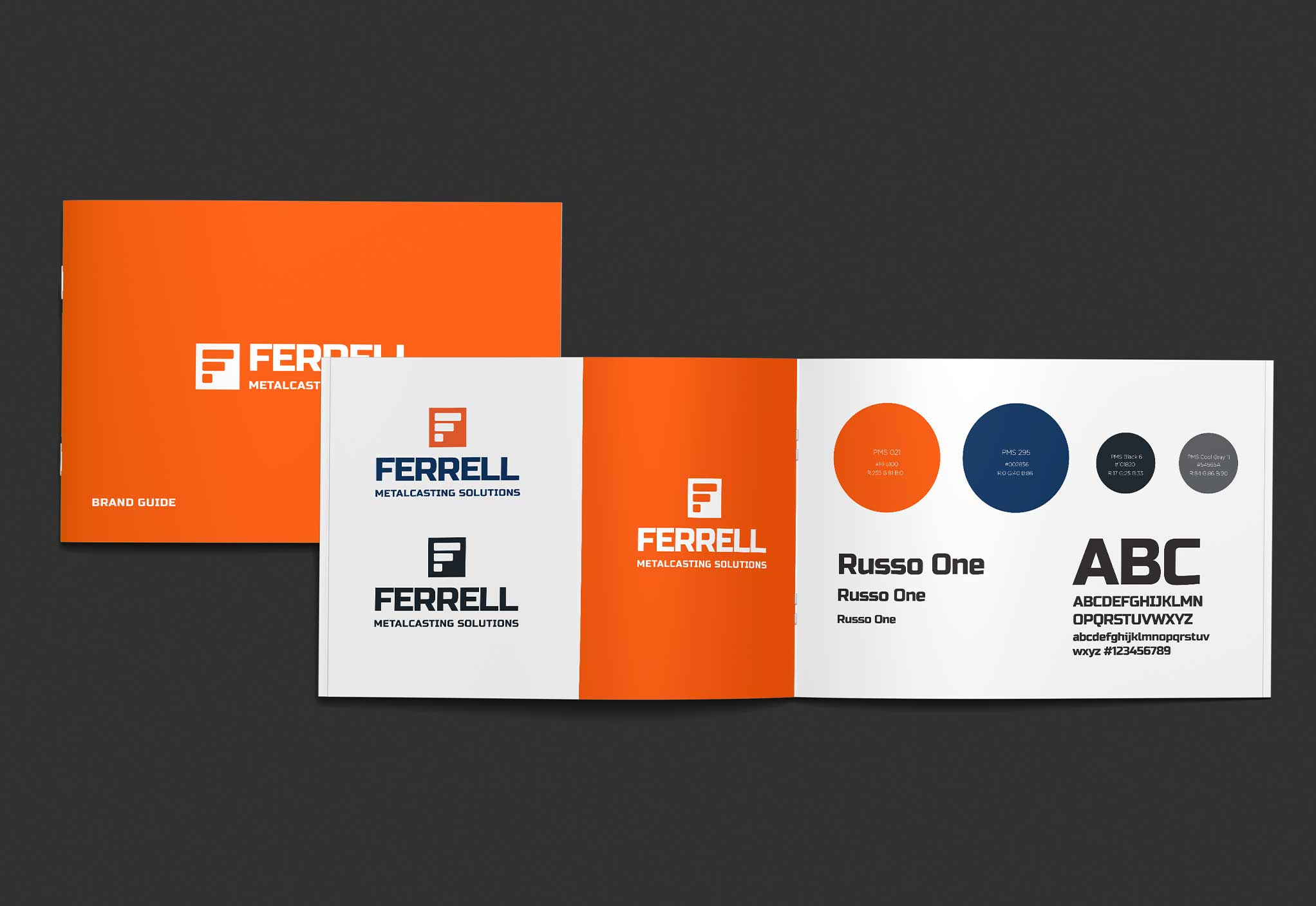
- Final branding guidelines
- Logo format for print and digital
Design tools:
- Illustrator
- Photoshop
Inspiration gallery
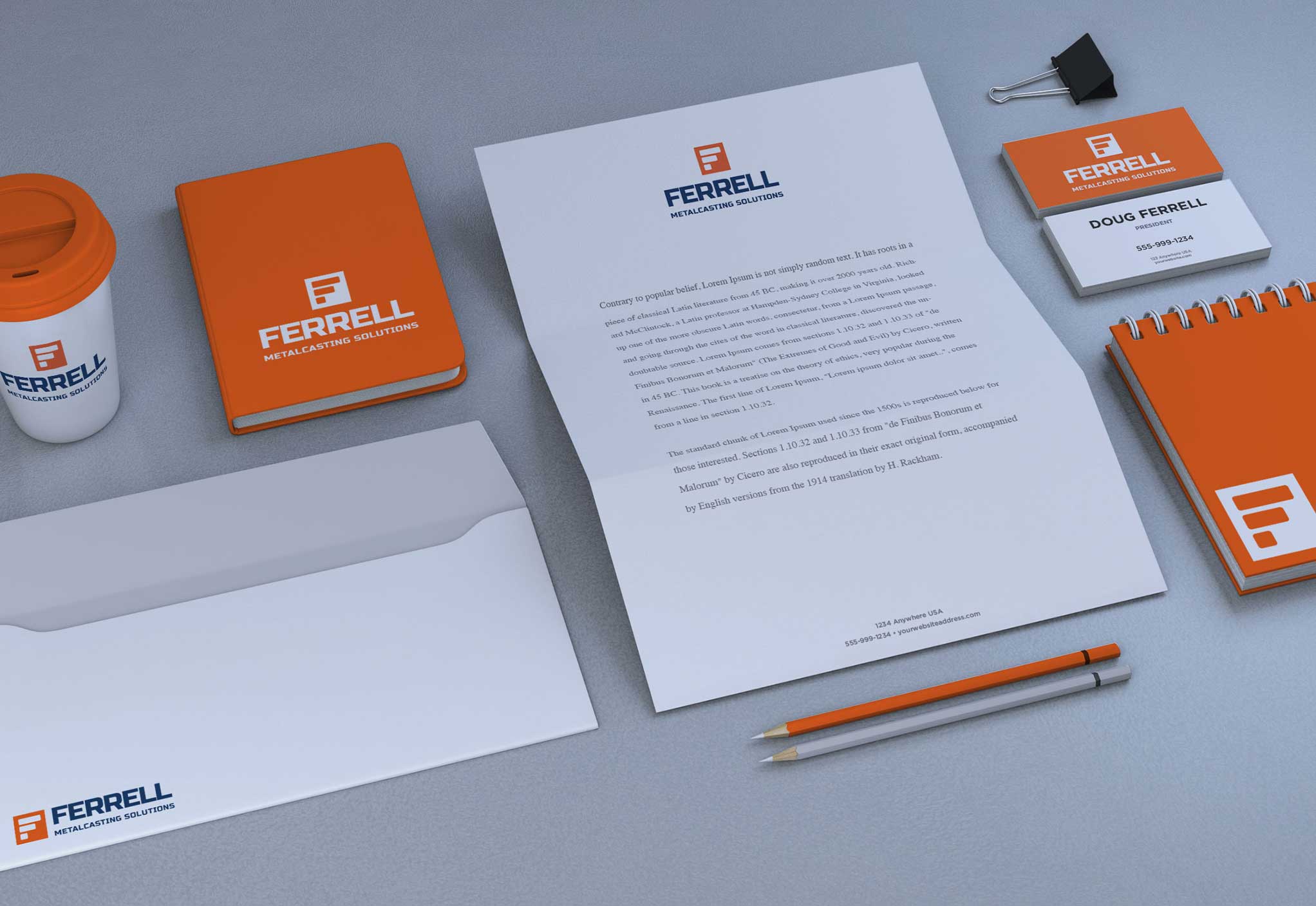
The following are examples from the logo presentation. While these are not all of the brand mockups presented to the client, these show how the logo could be used in collateral, products, packaging and branded materials.
