TEXOLA
TEXOLA Logo Design
About the project
TEXOLA is a construction company which specializes in roofing and renovations for commercial, residential, health care and other types of properties. They have offices in Texas, Oklahoma and Louisiana.
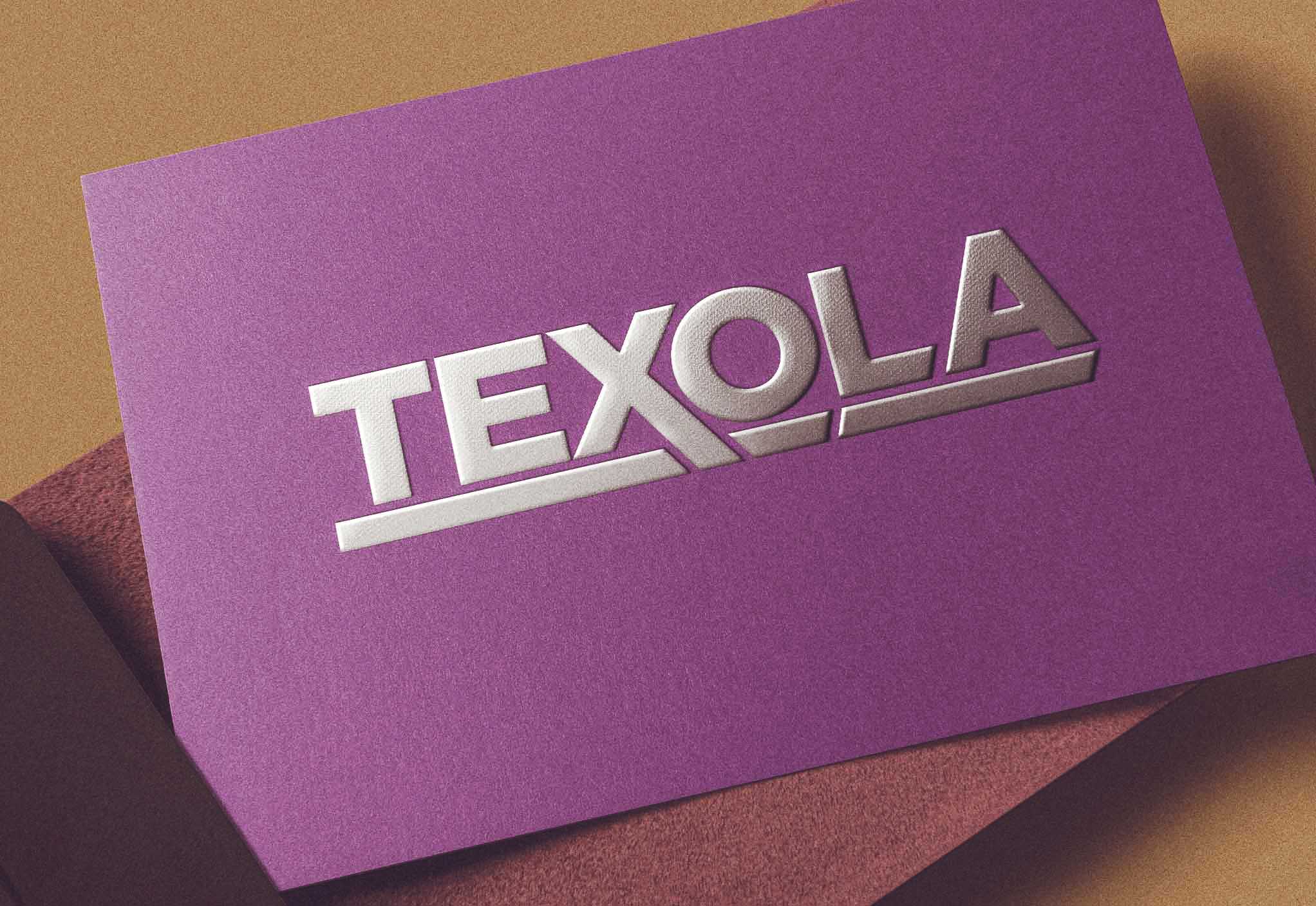
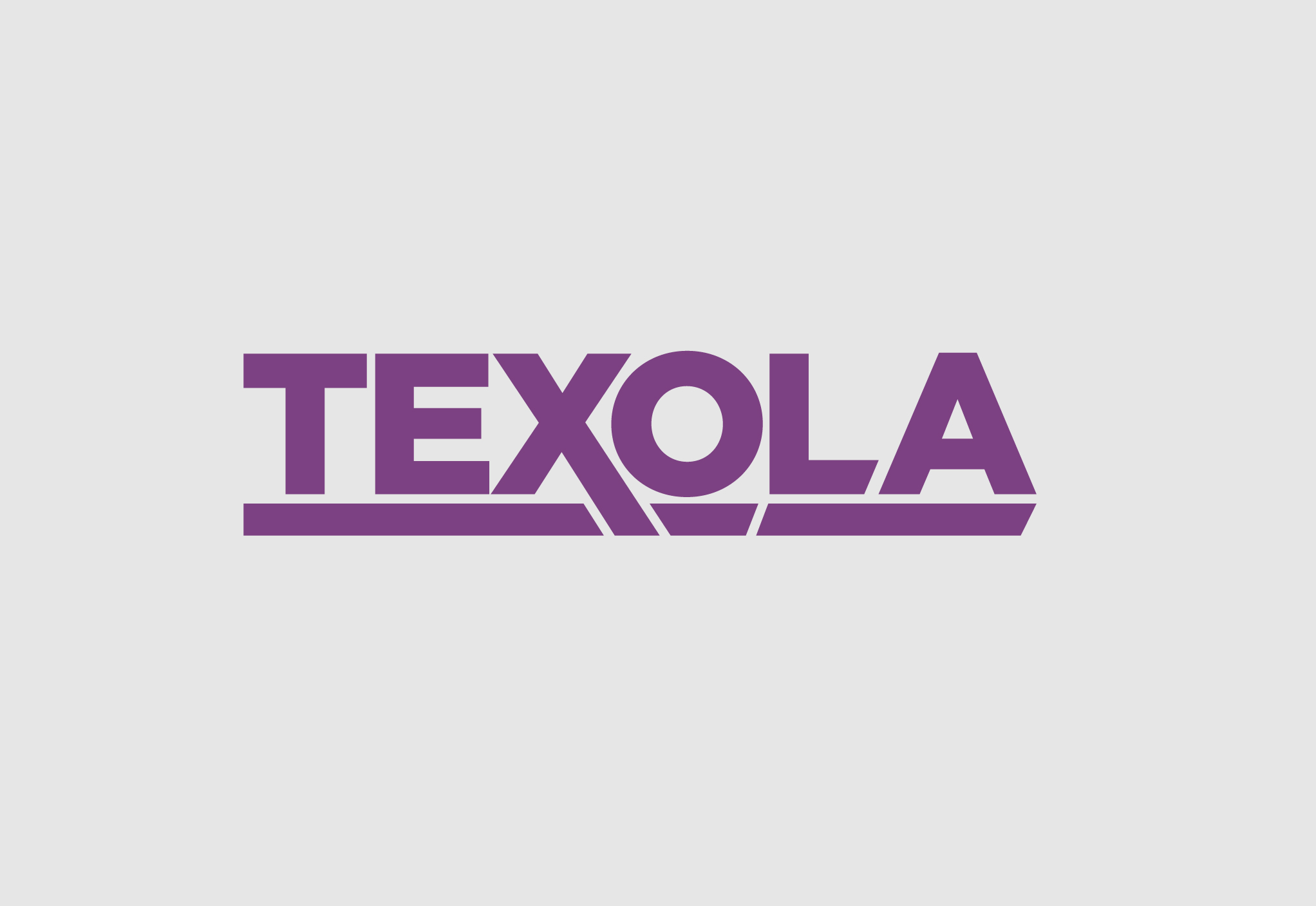
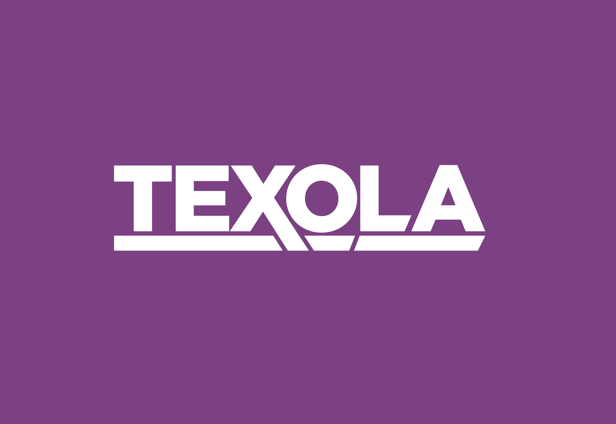
The TEXOLA logo is designed to represent the connection between Texas, Oklahoma and Louisiana. The TEX part represents Texas, the O represents Oklahoma and the LA represents Louisiana. The X in the logo extends beyond the baseline to represent the state boundary between Texas and Oklahoma. The slight diagonal line between the O and LA infers another state boundary. Each portion of the logo that is underlined is to accentuate the 3 states in which TEXOLA does construction work. Overall, the logo represents strength, quality and durability as to what the company strives to achieve on every project.
Deliverables:
-
- Original logo concepts
- Font selection
- Color palette selection
- Logo format for print and digital
Design tools:
- Illustrator
- Photoshop
Inspiration gallery
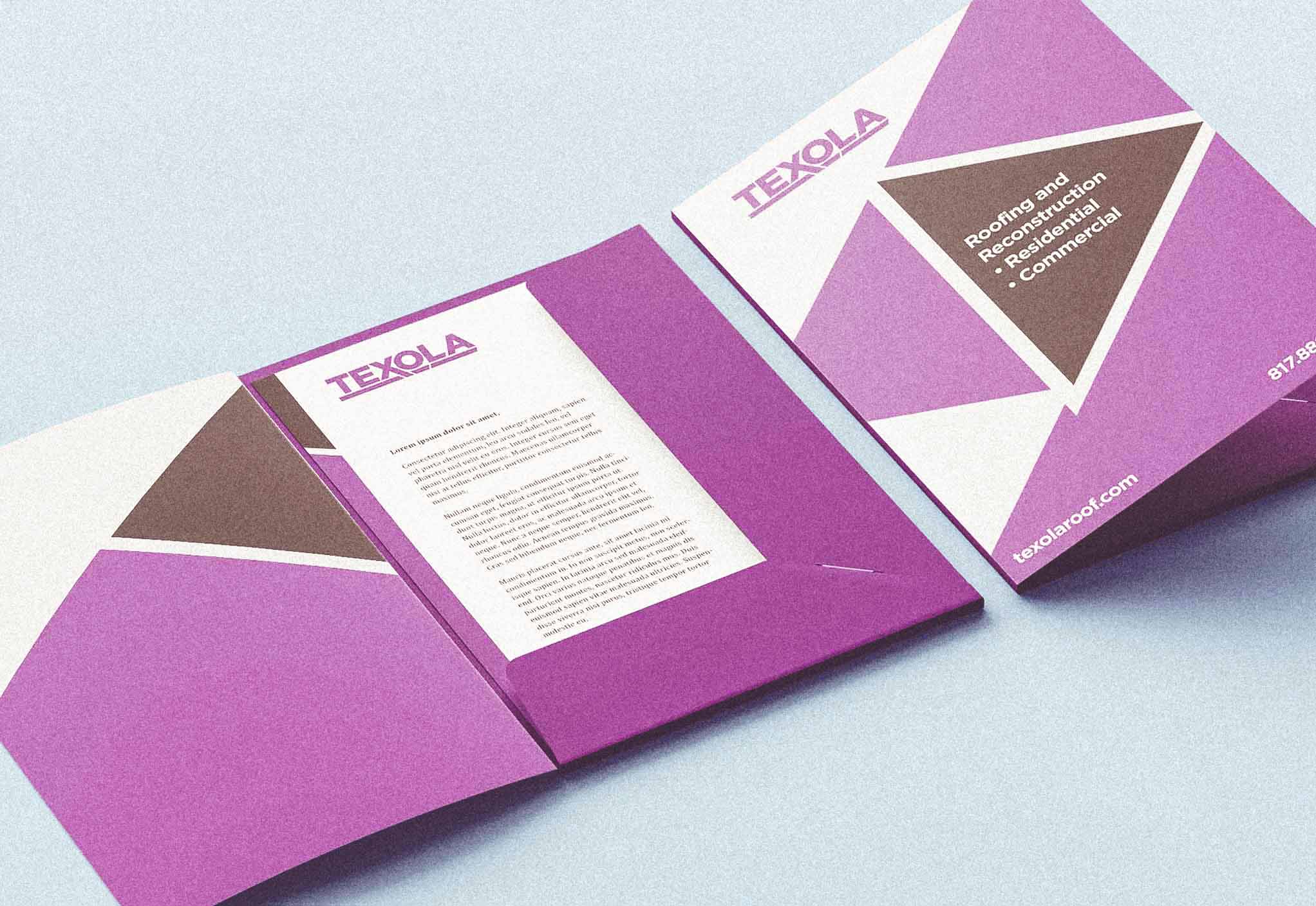
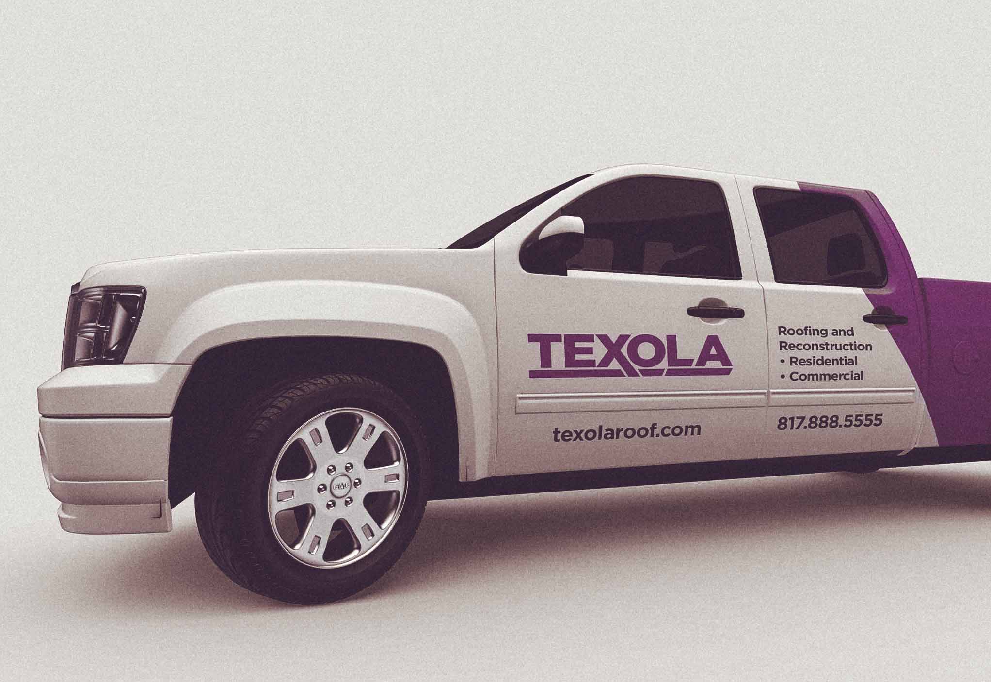
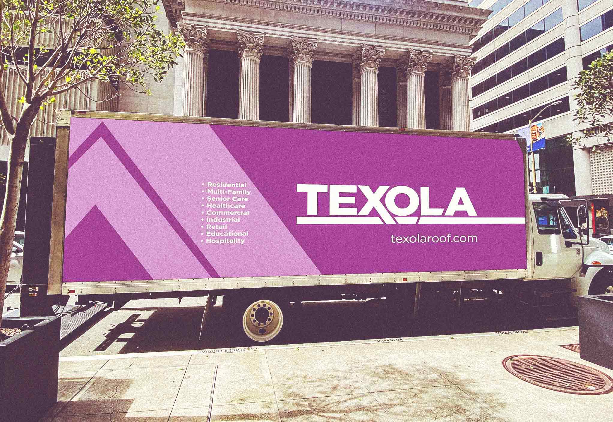
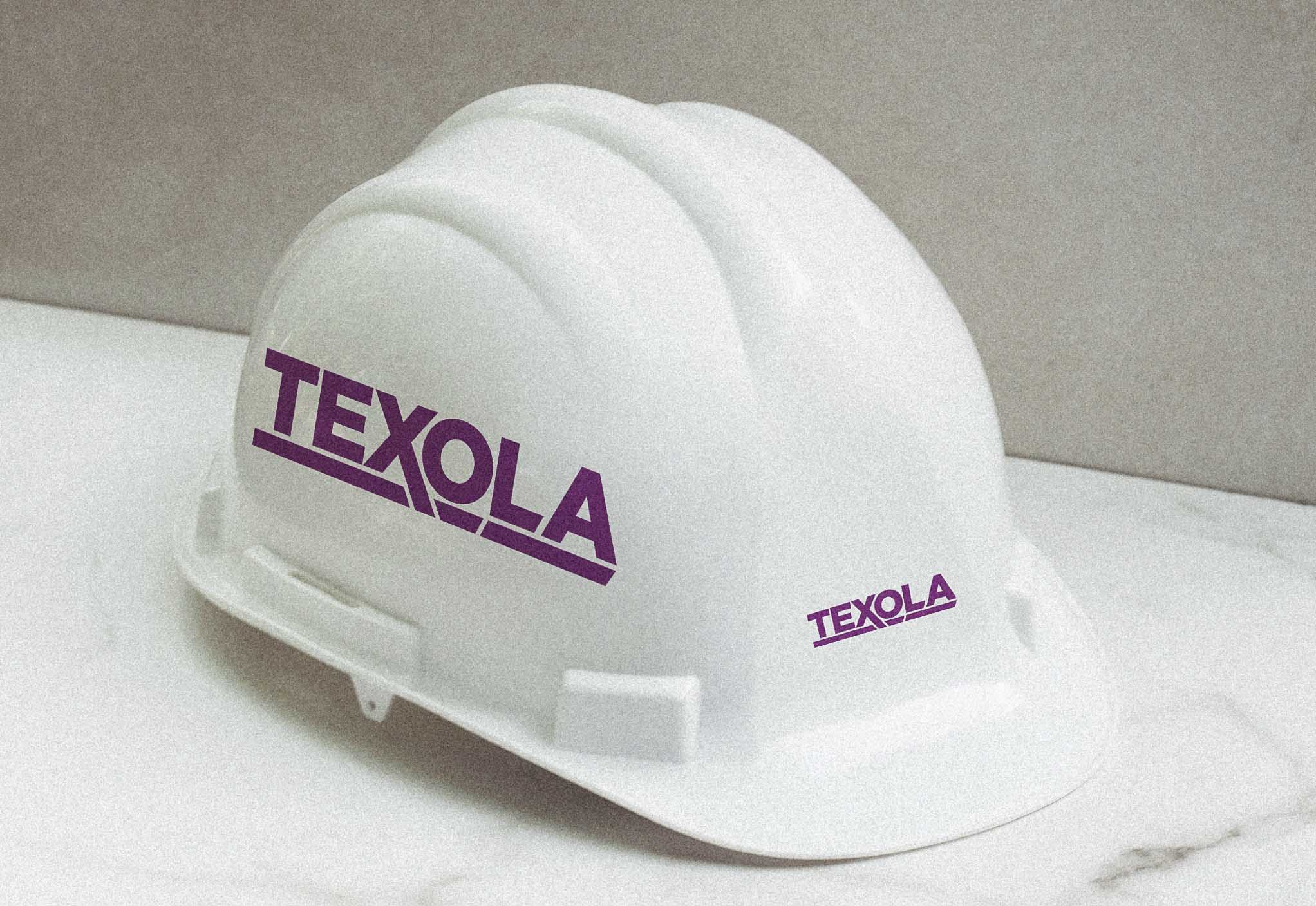
The following are examples from the logo presentation. While these are not all of the brand mockups presented to the client, these show how the logo could be used in collateral, products, packaging and branded materials.
